A lot of people think of wireframes when they think of UX. I guess it isnt far off. Many people who call themselves UX designers are busting out wireframes left and right.
I like to think of UX as more of a process than a creative effort. Designing intelligent solutions for users is great.
User tend to surprise us however and the only way we can gain really valuable insight into their needs is through testing and interaction.
I use wireframes as a way to visualize the design decisions we’ve arrived at after testing. Its a good way to show the rest of the team an idea for interaction.
Low to Mid fidelity wireframes are a great way of getting the conversation away from the visual design aspect of product development and focus on usability.
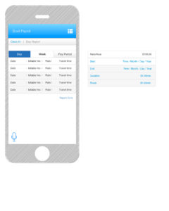
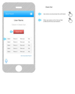
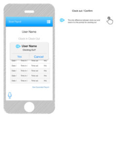
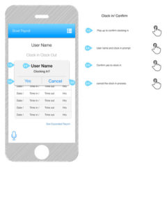
These were for a project in which we wanted a front end app that could interface with a 3rd party’s backend to create reliable timesheets for contractors.


