A note before the post: this is a write-up of how I used a specific UX research method, RITE, while building WhisperPad, a local-first voice-to-text app for macOS. It was run rapidly and informally during a graduate project. There are no formal session reports behind it, and that was a deliberate choice for the context. What follows is a practitioner’s account of what the method surfaced and how it changed the product.
The method
RITE stands for Rapid Iterative Testing and Evaluation. It was formalized at Microsoft Games, and its defining trait is not simply “test often.” It is this: when you observe a problem and the fix is obvious, you change the design immediately, sometimes after a single participant, and the next participant tests the new version. You do not wait for a full round of sessions to finish before acting.
I chose RITE for WhisperPad because the situation called for it. I had a working product, a tight core interaction, and limited time. I was not trying to validate a finished design. I was trying to find the friction I could not see myself, because I used the app every day and had gone blind to it. RITE is built for exactly that: fast loops, decisive changes, the design moving between participants.
I ran sessions with six participants, classmates from my program, a mix of technical and non-technical backgrounds. Sessions were short, roughly fifteen minutes, walking each person through onboarding, settings, and the core dictation flow. Two of those participants kept using the app afterward and became ongoing sources of feedback, which matters later in this post.
One discipline I held throughout: I did not act on everything I heard. I acted when a problem was clearly a problem, when something obvious to me as a daily user was clearly not obvious to the person in front of me. Chasing every comment is how you iterate yourself in circles. RITE works because the changes are decisive, and decisive requires judgment about which signals are real.
The chain that started with a missing signal
The most useful thing RITE surfaced was not a single finding. It was a chain, one problem leading to a fix that created the next problem, and I think the chain is more honest about how design actually works than a simple before-and-after would be.
The first version of WhisperPad had almost no feedback that transcription was happening. There was the small microphone icon macOS shows in the menu bar whenever any app has the mic open. It turns orange. But that is the generic system indicator, not something WhisperPad controls, and on a laptop screen it is very easy to miss. From the app’s point of view, you spoke into a void and text eventually appeared. (see below)
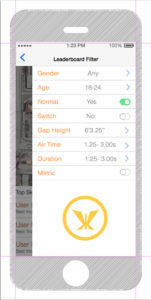
A participant named the gap directly. They said it would help to see the transcription happening, to watch the words appear in the text field as they spoke. That made sense. So I built it: live transcription, text inserted as you talk.
The first build of that feature was janky. Honestly it was close to unusable. I spent time tightening it until it was good enough to put in front of someone, and then I tested it.
That is where the next participant revealed a new and real problem. As they spoke, they started reading the text appearing on screen, their own words from a second or two earlier. And it derailed them. They slowed their speech to match what they were reading. They lost their train of thought. When they saw a small transcription error, it would distract them further. The lag made it worse: the words on screen never matched where they were in their thought, so the screen and the speaker were always slightly out of sync. (see below)
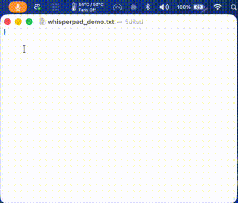
Live transcription, the thing a user had asked for, was actively breaking the core experience for the next user.
The principle: only default when you are 100% sure
Here is the decision that I think matters most, and it is a principle I now apply everywhere: I did not revert the feature, and I did not make it the default. I made it a toggle.
My rule is simple. A new feature only becomes the default behavior when I am 100% certain it improves the experience. Until then, it ships as an option the user can turn on. I was not certain live transcription was an improvement, the evidence was actively mixed, so it stayed available for the people who wanted it and stayed off by default for everyone else.
Back to the gap, not the failed solution
The failed feature did not make the original problem go away. Users still needed to know the app was working. Live transcription was a bad solution to a real gap, and the discipline is to separate those two things: throw out the solution, keep the problem.
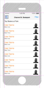
So I went back to the gap and designed a third option. While the app is listening, it types the word “listening” and animates an ellipsis after it, adding one dot at a time and clearing them, a small breathing animation, dot, dot, dot, clear, repeat, for as long as you are speaking. When you end capture with the keyboard shortcut, the indicator switches to “transcribing” with the same animation. Then it pastes your finished text. (see below)
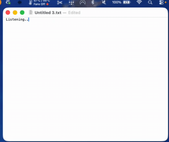
The point is that it gives you a clear signal the system is working without ever showing you your own words mid-thought. There is nothing to read along with, nothing to derail you. Just confirmation.
That tested noticeably better. It was not distracting, and it closed the feedback gap.
The real conclusion: the right answer was “let them choose”
Even with the listening indicator, testing did not converge on one perfect default. Some users liked the indicator. Others, including me, preferred silent mode, no on-screen feedback at all, just speak and the text appears when it is ready.
This is the part of the study I find most interesting, and it is the part a case study can sometimes hide. RITE did not hand me one correct design. It revealed that the correct design was different for different people, and that the right response was to stop hunting for a single universal default and instead give users genuine control over the mode they work in. WhisperPad ended up with three: silent, listening indicator, and live transcription. Each one exists because testing showed a real group of users it served, and each non-default mode exists as a toggle because I was not 100% sure any single one belonged to everyone.
The method revealed a real gap and also helped me validate the effectiveness or ineffectiveness of the solutions that I came up with in a very short amount of time.
A second example: pacing the onboarding
The same principle, cognitive load is the thing to design against, showed up in onboarding.
Early on, WhisperPad’s first-run setup was just the settings page. I opened it for the user and let them read through the options on their own. That was fine when there were only a few settings. But as the app grew, the first screen crossed a threshold, more than five distinct choices on a single page, and watching people meet that page, it was clearly too much at once. The typical response was to ignore it completely and then be confused about the behavior they encountered in the app later.
So I replaced the open-settings approach with an onboarding wizard: one decision per screen. Same settings, same choices, but paced. Each screen introduces one feature, explains it, and asks for one selection. The point is breathing room, giving the user space to understand each thing before the next one arrives, instead of facing the whole configuration surface at once.
The thread continued: solving it again under a constraint
One coda, because the story did not stop when the RITE testing did.
WhisperPad now ships in two versions. The direct-download version is my main branch, and it can paste transcribed text directly where your cursor is. The Mac App Store version cannot do that, because the accessibility permissions that automatic pasting requires are not something Apple will approve for the App Store, so that version places your text on the clipboard for you to paste yourself.
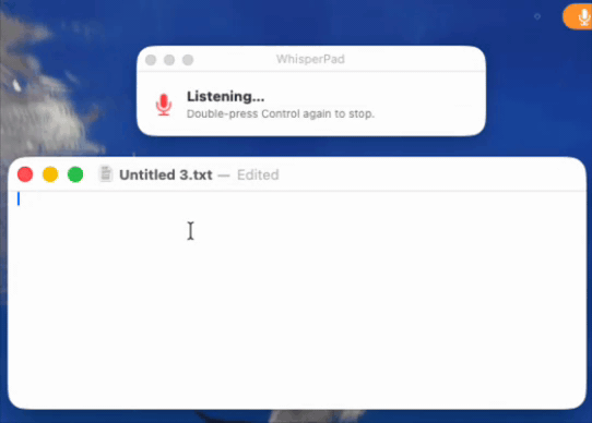
During review, Apple flagged that the App Store build felt slow or unclear, that it was hard to tell what was happening. That is the exact gap from the start of this post, returning in a new form. So I designed the signal again, this time as a small dedicated window: it says “listening,” shows a pulsing microphone icon, and tells the user precisely what to do next, double-press Control again to stop. When they do, the window switches to “transcribing” until the text is ready, then prompts them to paste. (see below)
I liked that solution enough that I brought it back to the direct version as another optional mode. In the App Store build it is on by default, because there it solves a problem the app would otherwise have. In the direct build it is a toggle, because, by now you know the rule, I was not 100% sure every user wanted it.
What I would take from this
A method is not a ritual. RITE was the right choice for WhisperPad because the conditions matched what RITE is for: a working product, a need to find friction I had gone blind to, and the ability to change the design fast between sessions. The same project used longitudinal check-ins with my two ongoing users for the slower questions a fifteen-minute session cannot reach. Different question, different method.
And the most portable thing I took from it is the toggle principle. Testing rarely hands you one universal answer. More often it shows you that users genuinely differ. When that happens, the move is not to pick a winner and impose it. It is to default to what you are certain of, and to let the user choose the rest.